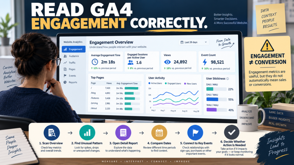
Google Analytics 4 provides an Engagement overview report designed to summarize how people interact with your website or app.
It can help you quickly examine:
- Engagement time.
- Engaged sessions.
- Views.
- Events.
- Popular pages.
- Recent user activity.
- User stickiness.
Google’s current documentation describes the Engagement overview as a pre-made overview report that summarizes engagement data, lets you compare important engagement metrics over time, and helps identify pages, screens, and features people interact with.
You can review the current Google Analytics Engagement overview documentation.
The most important lesson is:
Use the overview to find questions—not to declare success from one metric.
A visitor spending more time on a page may be good.
It may also mean the page is confusing.
More events may represent useful actions.
They may also represent ordinary page activity.
Engagement needs context.
Where to Find the Engagement Overview
In properties using the Life cycle reporting collection, Google’s current path is:
Reports → Engagement → Engagement overview
Google notes that the report is not shown by default in the Business objectives collection, although an Editor or Administrator can add it to reporting navigation.
That means two GA4 properties may not display identical navigation.
Do not assume the report disappeared simply because you cannot see it in the exact location shown in an older tutorial.
The Cards Can Be Customized
Google’s current documentation also notes that Administrators and Editors can change which summary cards appear.
Therefore, your Engagement overview may not look exactly like someone else’s.
The default report can include cards covering:
- Average engagement time.
- Engaged sessions per active user.
- Average engagement time per session.
- Active users in the last 30 minutes.
- Views.
- Event count.
- Event count by event name.
- Views by page title and screen class.
- User activity over time.
- User stickiness.
Treat the report as a configurable overview, not a fixed dashboard that every account must match.
Start With Average Engagement Time
Google defines average engagement time as the average time your website was in focus in the user’s browser or your app was in the foreground on the user’s device, calculated across active users.
This is different from assuming:
“Visitor had the page open for seven minutes.”
A browser tab sitting in the background is not the same as active engagement.
That makes engagement time more useful than a simple clock duration—but it still needs interpretation.
What Does Higher Engagement Time Mean?
Sometimes higher is encouraging.
For example:
A detailed tutorial receives:
4 minutes 30 seconds average engagement
while a thin article receives:
38 seconds
You might investigate whether the detailed tutorial better serves the visitor.
But higher time can also indicate difficulty.
A user may spend longer because:
- Instructions are confusing.
- Navigation is poor.
- Information is hard to find.
- The page requires excessive scrolling.
Never turn one metric into a story before checking the page.
Engaged Sessions per Active User
Google defines an engaged session as a session that:
- Lasts at least 10 seconds,
- Has at least one key event,
- Or has at least two page or screen views.
Engaged sessions per active user then relates those engaged sessions to active users.
This gives more context than asking only:
“How many sessions did I get?”
But remember what qualifies a session as engaged.
A session can be engaged without generating:
- Lead.
- Sale.
- Download.
- Contact request.
That is why engagement is not the same as conversion.
Average Engagement Time per Session
Another card can show average engagement time per session.
This asks:
How much engaged time occurred per session?
The metric can be useful when comparing:
- Periods.
- Traffic sources.
- Content groups.
- Campaigns.
But be careful about comparing radically different types of pages.
A contact page may complete its job quickly.
A 2,000-word tutorial should normally require more time.
The shorter session is not automatically worse.
Views and Event Count
The Engagement overview can show:
Views
and:
Event count
Google defines Views as the number of web pages or app screens users viewed, with repeat views counted, while Event count is the number of times events were collected.
More views can indicate:
- More traffic.
- More browsing.
- Repeated visits.
- Navigation loops.
More events can indicate:
- More interaction.
- More traffic.
- More automatically collected activity.
You must inspect the underlying events and pages before assigning meaning.
Open the Detailed Report
Overview cards are designed to summarize.
When something matters, move deeper.
For example:
If Views by Page title and screen class shows one article growing rapidly, open the detailed Pages and screens report.
My guide to using the GA4 Pages and Screens report without confusing views with landing pages explains how to analyze individual content beyond the overview card.
The workflow should be:
Overview → Pattern → Detail Report
not:
Overview → Conclusion
Use Event Count Carefully
A high event count sounds impressive.
But GA4 records many ordinary website interactions as events.
Google’s event model includes automatically collected events and other interactions depending on implementation.
The number becomes more useful when you ask:
Which events increased?
A rise in:
page_view
means something different from a rise in:
generate_lead
or a properly configured purchase-related event.
Your GA4 Events vs Key Events guide explains why ordinary events and business-important actions should not be treated as equivalent.
Top Pages Are a Starting Point
The Engagement overview can display views by page title and screen class.
This is convenient.
But it is still page-activity data.
A page can receive many views because:
- It ranks well.
- It is linked heavily.
- It is the homepage.
- It receives campaign traffic.
- Users repeatedly return to it.
Open the detailed report and examine:
- Active users.
- Engagement.
- Events.
- Key events.
- Relevant business outcomes.
Do not automatically create more articles like the page with the most views.
First understand why the page is attracting activity.
User Activity Over Time
The report can include active-user counts across:
- 1 day.
- 7 days.
- 30 days.
Google describes this card as a way to compare shorter-term user activity with broader periods.
This can help you detect:
- Recent traffic surges.
- Declining activity.
- Campaign effects.
- Seasonal patterns.
But a one-day movement should not automatically trigger a website change.
Compare longer periods.
User Stickiness
GA4’s Engagement overview can also include User stickiness.
Google currently calculates ratios such as:
- Daily Active Users / Monthly Active Users.
- Daily Active Users / Weekly Active Users.
- Weekly Active Users / Monthly Active Users.
Higher ratios can indicate that a larger proportion of the broader audience returns or remains active during shorter windows.
That can be meaningful for:
- Apps.
- Communities.
- Membership sites.
- Daily-use tools.
It may be less important for a website where visitors solve a problem once.
A Search Tutorial Does Not Need Daily Stickiness
Imagine someone searches:
“How do I fix a WordPress 404 error?”
They find your tutorial.
They solve the problem.
They leave.
They never return.
That could still be a successful visit.
A low return rate does not automatically mean the content failed.
Your business model determines which engagement measures matter.
Separate Engagement From Business Results
A content page can have:
High engagement + no leads
or:
Moderate engagement + strong lead generation
Which is better?
That depends on the page’s purpose.
For a lead-generation page, you may care more about:
- Form submission.
- Signup.
- Download.
- Key event.
For an educational article, you may also care about:
- Reading engagement.
- Navigation to another article.
- Return visits.
Do not use one universal definition of success.
Compare Similar Things
Good comparison:
Tutorial A vs Tutorial B
Less useful comparison:
Contact Page vs 3,000-word Tutorial
Good comparison:
This month vs previous month
Less useful:
Today vs an unusually high launch day
Keep the comparison fair.
Use Acquisition Context
Engagement can change because traffic changed.
Suppose average engagement falls.
Maybe the page did not get worse.
Maybe a social campaign sent a broader audience.
Check acquisition.
Your GA4 User Acquisition vs Traffic Acquisition guide can help identify whether you are examining first-user acquisition or current session sources.
A Practical Engagement Review
Once a month:
Step 1
Open Engagement overview.
Step 2
Compare a meaningful date range.
Step 3
Look for a large change.
Step 4
Identify which card shows the change.
Step 5
Open the detailed report.
Step 6
Determine which pages, events, or users contributed.
Step 7
Connect the change with a business objective.
Step 8
Take action only if the evidence supports it.
Example
Suppose:
Average engagement time rises 25%.
Do not immediately celebrate.
Open Pages and screens.
You discover:
One new tutorial attracted a large amount of highly engaged organic traffic.
Now you have a plausible explanation.
Then examine:
- Search source.
- Page behavior.
- Key events.
- Related content.
That is useful analysis.
Do Not Optimize for Engagement Time Alone
Trying to keep people on a page for as long as possible can create worse content.
A good answer should not be deliberately stretched.
If the user can solve the problem in two minutes instead of eight, that may be better.
Use engagement to understand behavior.
Do not turn it into a target that encourages unnecessary friction.
A Simple Engagement Worksheet
Record:
Date Range:
Average Engagement Time:
Engaged Sessions per Active User:
Top Pages:
Top Events:
Key Events:
Largest Change:
Possible Explanation:
Detail Report Checked:
Business Impact:
Action Needed: Yes / No
This turns the overview into a decision tool.
Conclusion
The GA4 Engagement overview provides a useful summary of how people interact with your website.
It can show engagement time, engaged sessions, views, events, page activity, recent users, and stickiness.
But every card needs context.
More time is not automatically better.
More events are not automatically conversions.
More views are not automatically valuable traffic.
Use the overview to identify a pattern.
Then open the appropriate detailed report and connect the behavior to the purpose of the page or business.
The best question is not:
“Is engagement up?”
It is:
“What changed, where did it change, and does that change matter to the business?”
That is how the Engagement overview becomes useful instead of becoming another dashboard filled with numbers.