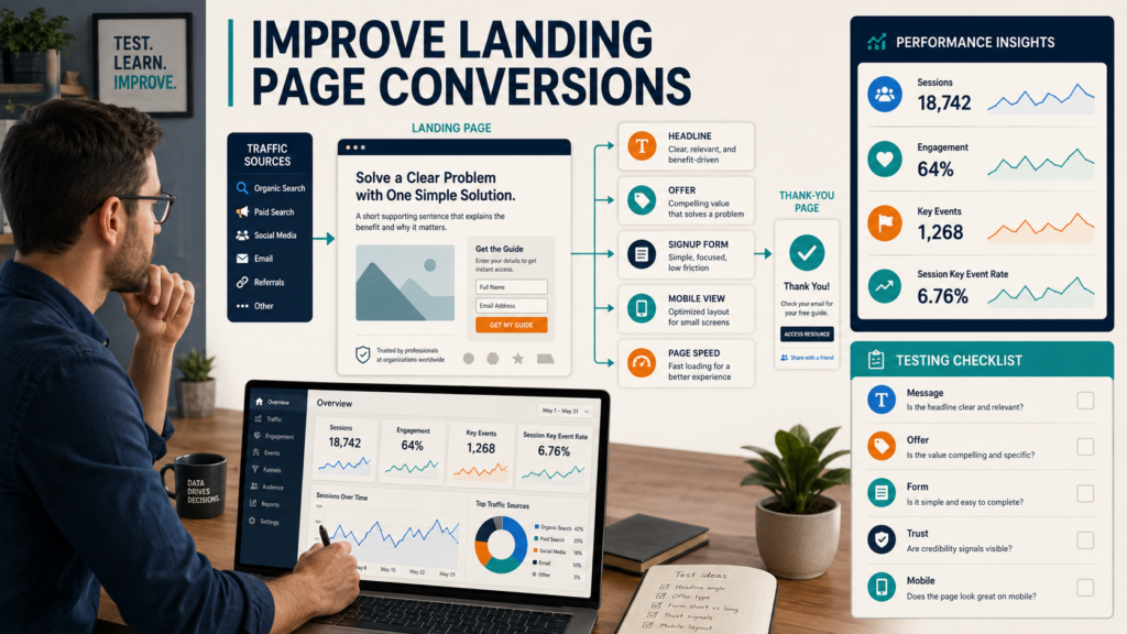
A landing page should make one important action easy to understand and easy to complete.
For a lead-generation page, that action may be joining an email list.
For a product page, it may be starting checkout.
For a webinar page, it may be registering.
If a page receives traffic but few people complete the intended action, do not immediately redesign the entire website. Start by identifying exactly what the page is supposed to accomplish and measuring what visitors currently do.
Google Analytics 4 includes a Landing Page report that shows the first page visitors reach during a session. Google also allows important actions to be marked as key events so website owners can evaluate how frequently those actions occur.
That gives marketers a practical starting point for landing-page improvement.
Key Takeaways
- Give each landing page one primary action.
- Measure the action as a meaningful event or key event.
- Review landing-page performance in GA4.
- Match the headline with the traffic source.
- Make the offer specific.
- Remove unnecessary form fields.
- Test the mobile experience.
- Change one major element at a time.
- Avoid assuming that every problem is caused by design.
Define the Conversion
Before calculating a conversion rate, define what a conversion means for this page.
Possible actions include:
- Lead-magnet signup.
- Contact form submission.
- Purchase.
- Webinar registration.
- Trial signup.
- Appointment request.
- Download.
- Account creation.
GA4 currently refers to particularly important business actions as key events. Any event you collect can be marked as a key event when that action matters to your business.
For a lead-magnet page, a completed subscriber signup may be the key event.
A page view is not enough.
Confirm That Tracking Works
Before changing the page:
- Visit it yourself.
- Submit the form.
- Reach the confirmation page.
- Check whether the intended event records.
- Confirm that it is marked correctly when appropriate.
- Test different devices.
Google provides a current GA4 tutorial showing how a confirmation-page view can be used to create a generate_lead event and then be marked as a key event.
Do not optimize based on broken measurement.
Calculate the Basic Conversion Rate
A simplified page conversion rate can be calculated as:
Completed desired actions ÷ relevant visits × 100
For example:
500 landing-page sessions.
25 completed signups.
25 ÷ 500 = 5%.
The number itself does not tell you whether the page is good or bad.
Compare:
- Similar pages.
- Historical performance.
- Traffic sources.
- Mobile versus desktop.
- Different offers.
Context matters.
Open the GA4 Landing Page Report
The GA4 Landing Page report is designed to show the first page visitors reach during a session. Google says the report can help website owners identify landing pages that perform well and those that may need improvement.
Review:
- Sessions.
- Active users.
- Engagement.
- Key events.
- Revenue if appropriate.
Then compare landing pages serving similar purposes.
Do not compare:
- A blog article.
- A checkout page.
- A contact page.
as though they have the same objective.
Segment by Traffic Source
A landing page may perform differently according to where visitors came from.
Traffic could include:
- Google Search.
- Facebook.
- LinkedIn.
- Email.
- YouTube.
- Paid advertising.
- Referral partners.
Suppose an email subscriber clicks:
Download the Ebook Planning Worksheet
and lands on a page offering:
Join My Online Business Newsletter.
The message changed.
Conversion may suffer because the visitor expected a worksheet.
The page must match the promise that generated the click.
Review the Headline
A landing-page headline should answer:
What do I get and why should I care?
Weak:
“Welcome to Our Resource Center.”
Stronger:
“Download the 10-Question Ebook Topic Planning Worksheet.”
The second headline is specific.
It explains what the visitor receives.
Improve the Offer Before the Design
A weak offer does not become strong because the button is orange.
Ask:
- Is the resource useful?
- Is the problem important?
- Is the promised result specific?
- Does it match the traffic source?
- Is the audience clear?
- Is the benefit understandable?
For example:
Free Ebook
is vague.
Free Checklist: 15 Items to Review Before Publishing Your First Ebook
is more specific.
Simplify the Page
A focused lead-generation page may need:
- Headline.
- Short explanation.
- Benefit bullets.
- Image of the resource.
- Signup form.
- Privacy information.
- Trust elements.
- One clear button.
It may not need:
- Full website navigation.
- Several product offers.
- Large social feeds.
- Unrelated blog posts.
- Multiple popups.
- Autoplay video.
- Several CTAs.
Every extra decision can distract from the primary action.
Reduce Form Friction
Ask only for information you genuinely need.
A lead magnet may need:
- First name.
- Email address.
Potentially only:
- Email address.
Do you really need:
- Last name?
- Company?
- Telephone?
- Job title?
- Address?
If not, consider removing them.
The form should also explain what happens after submission.
Improve the Button
The button should communicate the action.
Instead of:
Submit
try:
Send Me the Checklist
or:
Get the Free Worksheet
The button should accurately describe what occurs.
Do not use fake urgency.
Add Appropriate Trust Information
Trust elements may include:
- Clear business identity.
- Privacy-policy link.
- Contact information.
- Accurate description of future emails.
- Affiliate disclosure when relevant.
- Secure checkout indicators when purchasing.
- Real customer testimonials when available and authorized.
Do not use fake reviews, stock-photo testimonials, or unsupported trust badges.
Check Mobile Layout
A page may look excellent on a large monitor and fail on a phone.
Test:
- Headline size.
- Button visibility.
- Form fields.
- Image dimensions.
- Popups.
- Spacing.
- Loading.
- Navigation.
- Confirmation page.
Complete the signup process with your own phone.
Do not rely only on the editor’s preview.
Test Page Speed and Usability
Slow-loading or unstable pages can create friction.
Large images, unnecessary scripts, video backgrounds, and third-party widgets can affect the experience.
Google’s current people-first guidance includes providing a good overall page experience rather than optimizing only one isolated metric.
The practical goal is simple:
Make the page easy to use.
Review the Confirmation Experience
Conversion optimization does not end when the button is clicked.
The confirmation page should explain:
- The submission succeeded.
- Where the resource is.
- Whether an email is coming.
- What to do if the email does not arrive.
- The logical next action.
If someone joins for a checklist and then sees a confusing blank page, the experience feels incomplete.
Measure the Right Key Event
Do not treat every click as a successful conversion.
Examples:
Button click: useful diagnostic event.
Form successfully submitted: stronger lead event.
Purchase completed: sales event.
GA4 allows businesses to identify important events and mark those as key events.
Choose the event that represents actual completion.
Use a Landing Page Diagnosis Table
Record:
| Question | Finding |
|---|---|
| Who is the visitor? | |
| Where did traffic come from? | |
| What was promised before the click? | |
| What does the headline promise? | |
| What is the primary action? | |
| Is tracking working? | |
| What is the current rate? | |
| Where does mobile struggle? | |
| What question remains unanswered? | |
| What should be tested first? |
This prevents random redesign.
Test One Major Change at a Time
Possible tests include:
- Headline.
- Lead magnet.
- Benefit statement.
- Hero image.
- Button wording.
- Form length.
- Trust element.
- CTA placement.
If you change everything at once and performance improves, you do not know which change mattered.
For a small website with limited traffic, formal statistical testing may take too long.
You can still make evidence-based improvements by:
- Identifying obvious friction.
- Making one meaningful change.
- Recording the date.
- Comparing reasonable periods.
- Watching for consistent patterns.
Do Not Copy High-Converting Pages Blindly
A competitor’s page may work because of:
- Different audience.
- Strong brand recognition.
- Paid traffic.
- Better offer.
- Existing customers.
- Lower price.
Copying the layout does not copy the context.
Study principles.
Do not copy proprietary wording or design.
A Practical Example
Suppose a lead-magnet page receives 600 monthly sessions and 18 signups.
The marketer notices:
- Most traffic comes from an article about creating ebooks.
- The landing-page headline says “Join Our Business Newsletter.”
- The form requests name, email, company, telephone, and website.
- The promised ebook worksheet is mentioned below the fold.
The first improvement should probably not be changing button color.
A better test might:
- Rewrite the headline around the ebook worksheet.
- Move the resource image upward.
- Reduce the form to first name and email.
- Explain exactly what the subscriber receives.
- Keep one primary CTA.
Then monitor the result.
A Landing Page Improvement Checklist
Tracking
- GA4 installed.
- Key event defined.
- Form submission tested.
- Confirmation tested.
Message
- Headline matches traffic.
- Offer is specific.
- Benefits are clear.
- Reader understands the result.
Form
- Only necessary fields included.
- Button describes the action.
- Error messages work.
- Mobile form works.
Trust
- Privacy link present.
- Business identity clear.
- Claims realistic.
- Testimonials genuine.
Technical
- Page loads correctly.
- Mobile layout tested.
- Images optimized.
- Links tested.
Measurement
- Baseline recorded.
- One major change selected.
- Test date documented.
- Results reviewed after enough data accumulates.
Common Mistakes
Changing design before tracking
You need a baseline.
Optimizing the wrong action
Button clicks are not always completed leads.
Ignoring traffic source
Message mismatch can reduce response.
Asking for too much information
Every field should have a purpose.
Using fake urgency
Trust matters more.
Failing to test mobile
A large portion of visitors may use phones.
Making constant changes
Allow enough time to interpret results.
Conclusion
Improving a landing-page conversion rate begins with defining the desired action and confirming that you can measure it accurately.
Then review the visitor, traffic source, headline, offer, form, trust information, mobile experience, and confirmation process.
Use GA4’s Landing Page reporting and key events to understand what happens, but do not let analytics replace common sense. A visitor should immediately understand what is being offered and what happens after clicking the button.
Choose one important landing page, verify its key event, and complete the diagnostic table before redesigning anything.